Bootstrap 4
What is Bootstrap....
- Bootstrap is a free front-end framework for faster and easier web development
- Bootstrap includes HTML and CSS based design templates for typography, forms, buttons, tables, navigation, modals, image carousels and many other, as well as optional JavaScript plugins
- Bootstrap also gives you the ability to easily create responsive designs
History
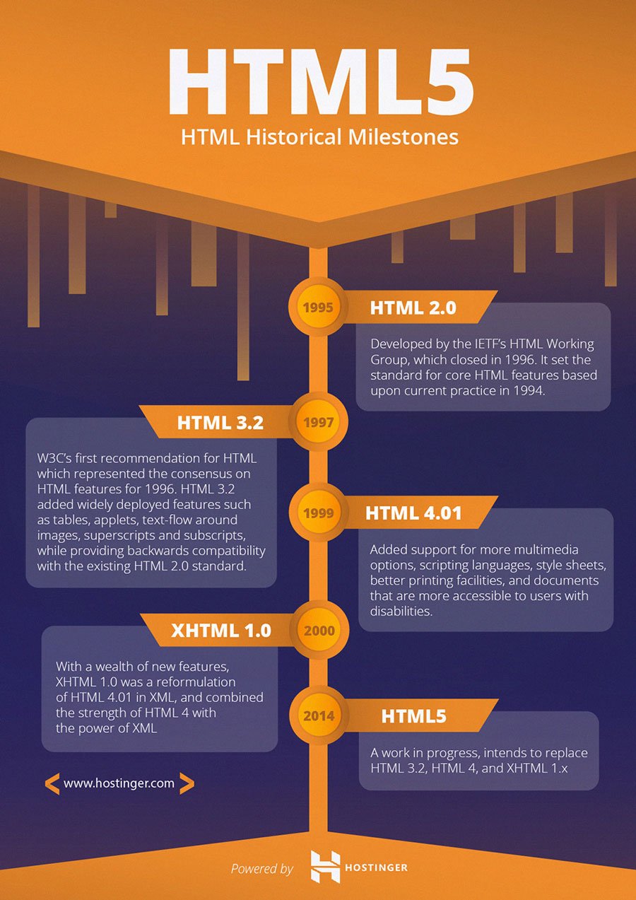
- Bootstrap, originally named Twitter Blueprint, was developed by Mark Otto and Jacob Thornton at Twitter as a framework to encourage consistency across internal tools. Before Bootstrap, various libraries were used for interface development, which led to inconsistencies and a high maintenance burden. According to Twitter developer Mark Otto
- After a few months of development by a small group, many developers at Twitter began to contribute to the project as a part of Hack Week, a hackathon-style week for the Twitter development team. It was renamed from Twitter Blueprint to Bootstrap, and released as an open source project on August 19, 2011. It has continued to be maintained by Mark Otto, Jacob Thornton, and a small group of core developers, as well as a large community of contributors.
- On January 31, 2012, Bootstrap 2 was released, which added built-in support for Glyphicons, several new components, as well as changes to many of the existing components. This version supports responsive web design. This means the layout of web pages adjusts dynamically, taking into account the characteristics of the device used (desktop, tablet, mobile phone).
- The next major version, Bootstrap 3, was released on August 19, 2013. It redesigned components to use flat design, and a mobile first approach.
What is Responsive Web Design....
- Responsive web design is about creating web sites which automatically adjust themselves to look good on all devices, from small phones to large desktops.
Why we use bootstrap....
- Easy to use: Anybody with just basic knowledge of HTML and CSS can start using Bootstrap
- Responsive features: Bootstrap's responsive CSS adjusts to phones, tablets, and desktops
- Mobile-first approach: In Bootstrap, mobile-first styles are part of the core framework
- Browser compatibility: Bootstrap 4 is compatible with all modern browsers (Chrome, Firefox, Internet Explorer 10+, Edge, Safari, and Opera)
What Bootstrap Package Includes?
- Scaffolding: Bootstrap provides a basic structure with Grid System, link styles, background. This is is covered in detail in the section Bootstrap Basic Structure
- CSS: Bootstrap comes with feature of global CSS settings, fundamental HTML elements styled and enhanced with extensible classes, and an advanced grid system. This is covered in detail in the section Bootstrap with CSS.
- Components: Bootstrap contains over a dozen reusable components built to provide iconography, dropdowns, navigation, alerts, popovers, and much more. This is covered in detail in the section Layout Components.
- JavaScript Plugins: Bootstrap contains over a dozen custom jQuery plugins. You can easily include them all, or one by one. This is covered in details in the section Bootstrap Plugins.
- Customize: You can customize Bootstrap's components, LESS variables, and jQuery plugins to get your very own version.
Where to Get Bootstrap 4....
- You can download the latest version of Bootstrap from http://getbootstrap.com/. When you click on this link
- There are two ways to start using Bootstrap 4 on your own web site.
- You can:Include Bootstrap 4 from a CDN
- Download Bootstrap 4 from getbootstrap.com
File structure
Pre-Compiled Bootstrap
- Once the compiled version Bootstrap is downloaded, extract the ZIP file, and you will see the following file/directory structure

- As you can see there are compiled CSS and JS (bootstrap.*), as well as compiled and minified CSS and JS (bootstrap.min.*). Fonts from Glyphicons are included, as is the optional Bootstrap theme.
Bootstrap Source Code
- If you downloaded the Bootstrap source code then the file structure would be as follows:

- The files under less/, js/, and fonts/ are the source code for Bootstrap CSS, JS, and icon fonts (respectively).
- The dist/ folder includes everything listed in the pre-compiled download section above. docs-assets/, examples/, and all *.html files are Bootstrap documentation.
HTML 5 DOCTYPE
- Bootstrap requires the use of the HTML5 doctype. Without it, you’ll see some funky incomplete styling, but including it shouldn’t cause any considerable hiccups.

Responsive meta tag

Bootstrap is developed mobile first, a strategy in which we optimize code for mobile devices first and then scale up components as necessary using CSS media queries. To ensure proper rendering and touch zooming for all devices, add the responsive viewport meta tag to your <head>.
<head>.


